

100% Growth
In sales after launch
2x Growth
In weekend bookings
97/100 Score
Google Lighthouse, desktop
About Flyover
Flyover started life as a cult favourite chai bar and takeaway spot in Sydney's CBD, the kind of place people went out of their way for. When founder Gunjan Aylawadi decided to move it to Redfern and turn it into a full-service restaurant, she wasn't just changing the menu or the address. She was stepping into a bigger vision: a modern, vibrant home for conscious vegetarian dining that stayed true to where it came from while growing into something new.
ReCo was brought in to guide that shift from the ground up, starting with the research and strategy behind the brand, then carrying it through into the visual identity, copywriting and website that would bring it to life. This case study covers the full journey, from the first conversations with Gunjan and her team to the launch that changed how Sydney saw Flyover.
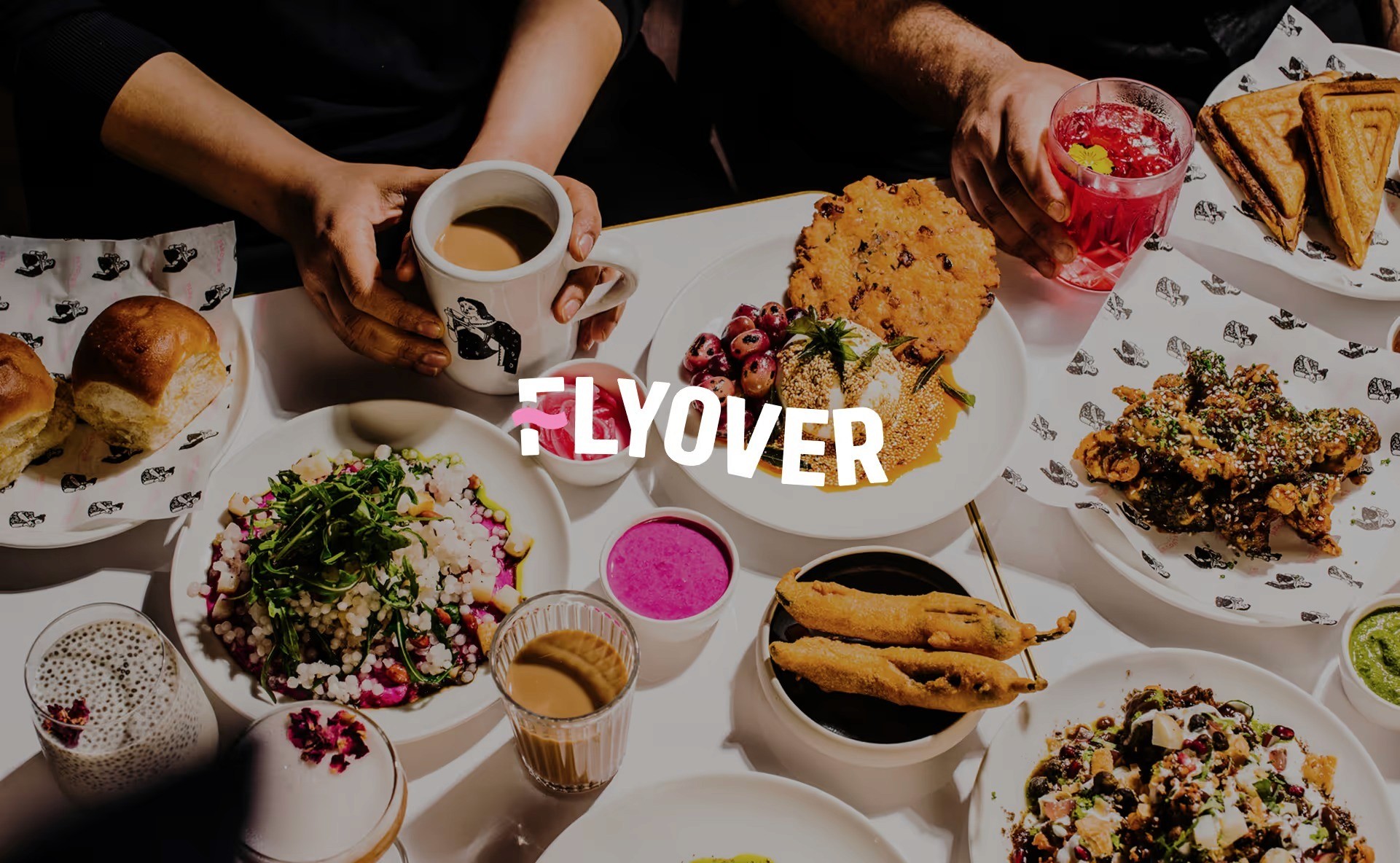
The brief: rebrand, recognition and bookings
Understand brand perception and identify opportunities for growth
Validate Gunjan’s vision with real data and insight
Shape the brand’s key messaging, positioning and visual direction
Refresh the identity without losing the recognition Flyover had already built
Build a website that showcases what Flyover offers and makes booking easy
01 Immersive discovery: understanding Flyover from the inside
We started by simply spending time at Flyover. Eating there, watching how people moved through the space, listening to what staff and customers said without prompting. Alongside on-site immersion, we ran workshops with Gunjan and her team to surface the challenges sitting underneath the surface, from how the offering was being understood to how well the space matched what customers expected walking in.
That phase let the team see their own brand from the outside for the first time. It became the foundation for everything that followed, not just the direction of the brand but also how the day-to-day experience could run more smoothly.
Grounding the work in what was actually happening, rather than in assumptions, is what let the rebrand stay true to Gunjan’s vision while still facing the practical realities of the move.
02 Customer research: who was driving loyalty
Collaborating with Gunjan and her team, we curated a focus group of Flyover’s top supporters, from long-time fans and occasional diners to curious locals in Redfern. Through one-on-one interviews, we explored what drew them in, what kept them coming back, and what barriers existed for others.
2 core customer personas emerged, along with a key insight: Flyover’s values and story were already deeply resonant but not always clearly communicated. The heart of the brand was strong. It simply needed to be brought to the surface with greater clarity and confidence.
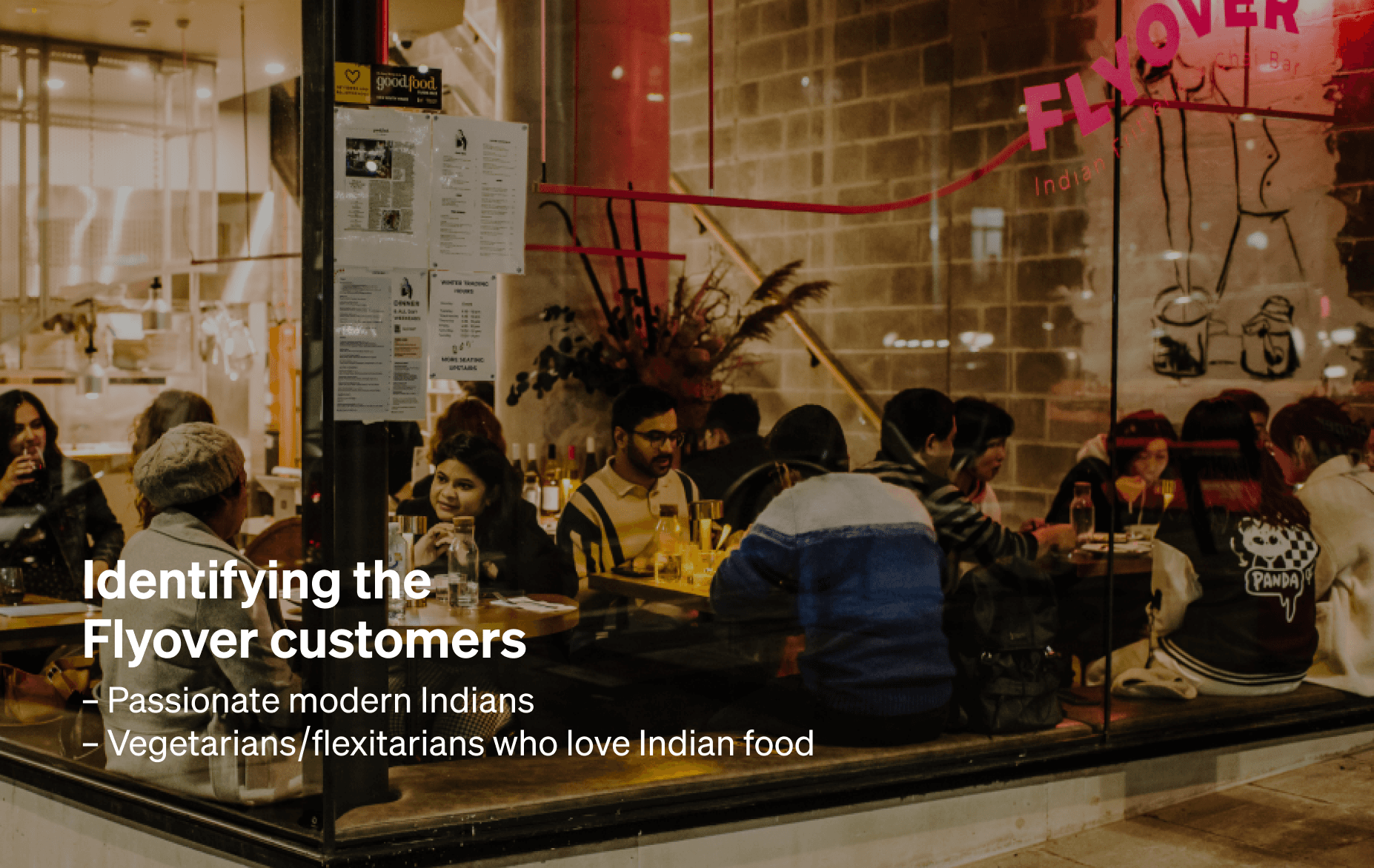
03 Positioning Flyover: vegetarian-first, culturally authentic
Flyover challenges the familiar stereotypes of Indian restaurants in Sydney. Its vision is bold, modern and deeply personal, blending street food heritage with a design-forward approach to conscious dining.
Through research, we identified a key strategic opportunity: while Flyover’s food is proudly Indian, its vegetarian offering gave it broader, purpose-led appeal. In Australia, 12.1% of people identify as vegetarian or mostly vegetarian, according to Roy Morgan, and that number continues to grow. Positioning Flyover as a vegetarian-first brand with deep Indian roots let us frame it as both culturally authentic and genuinely relevant to modern dining trends.
04 Brand identity for a growing restaurant
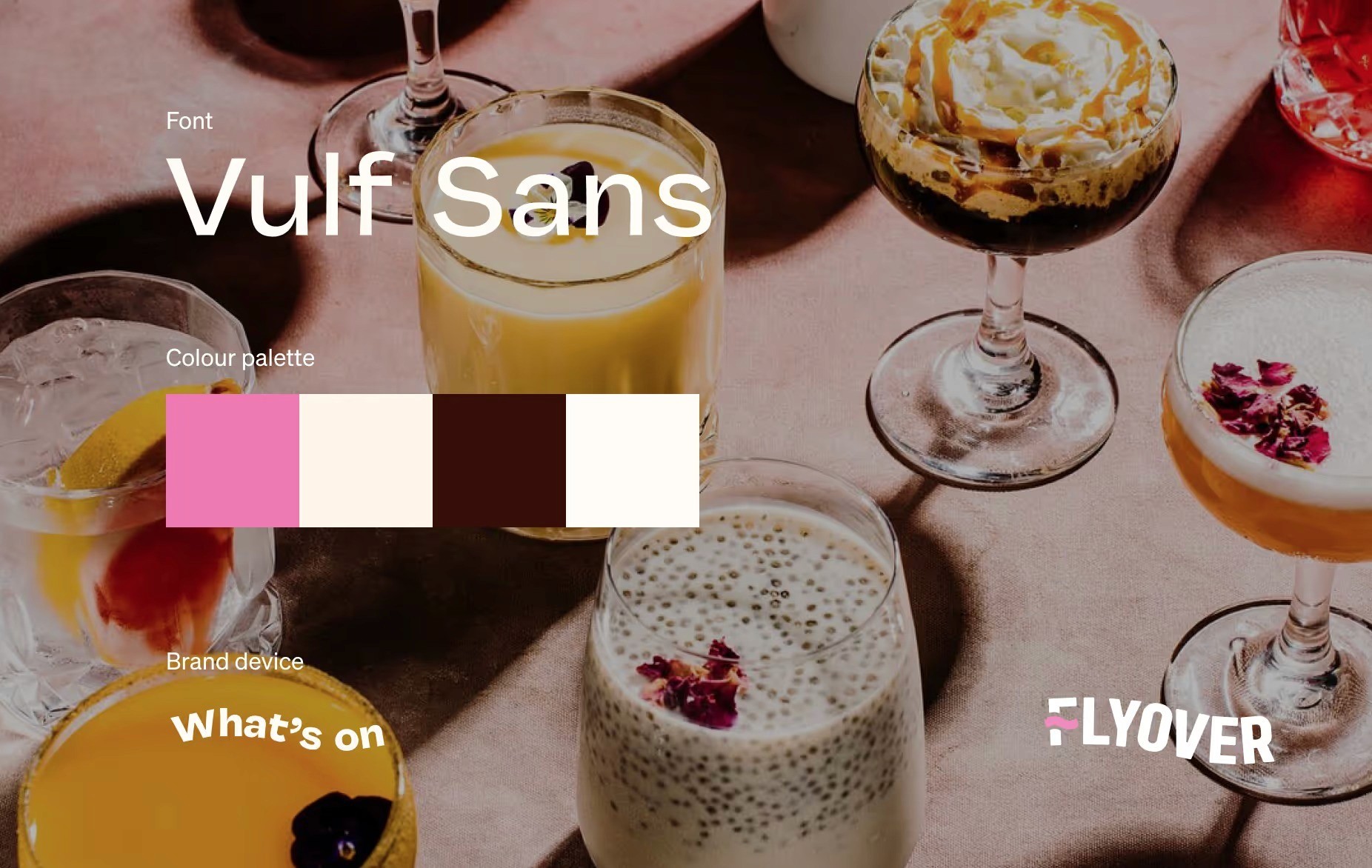
Rather than reinventing the brand, we chose to refresh it. The curved logo was subtly refined, the iconic pink hue softened for a more premium feel, and the hand-drawn illustrations customers already loved were retained. The tone of voice, closely tied to Gunjan’s own personality, stayed warm and humorous, while the messaging was sharpened for greater clarity and confidence.
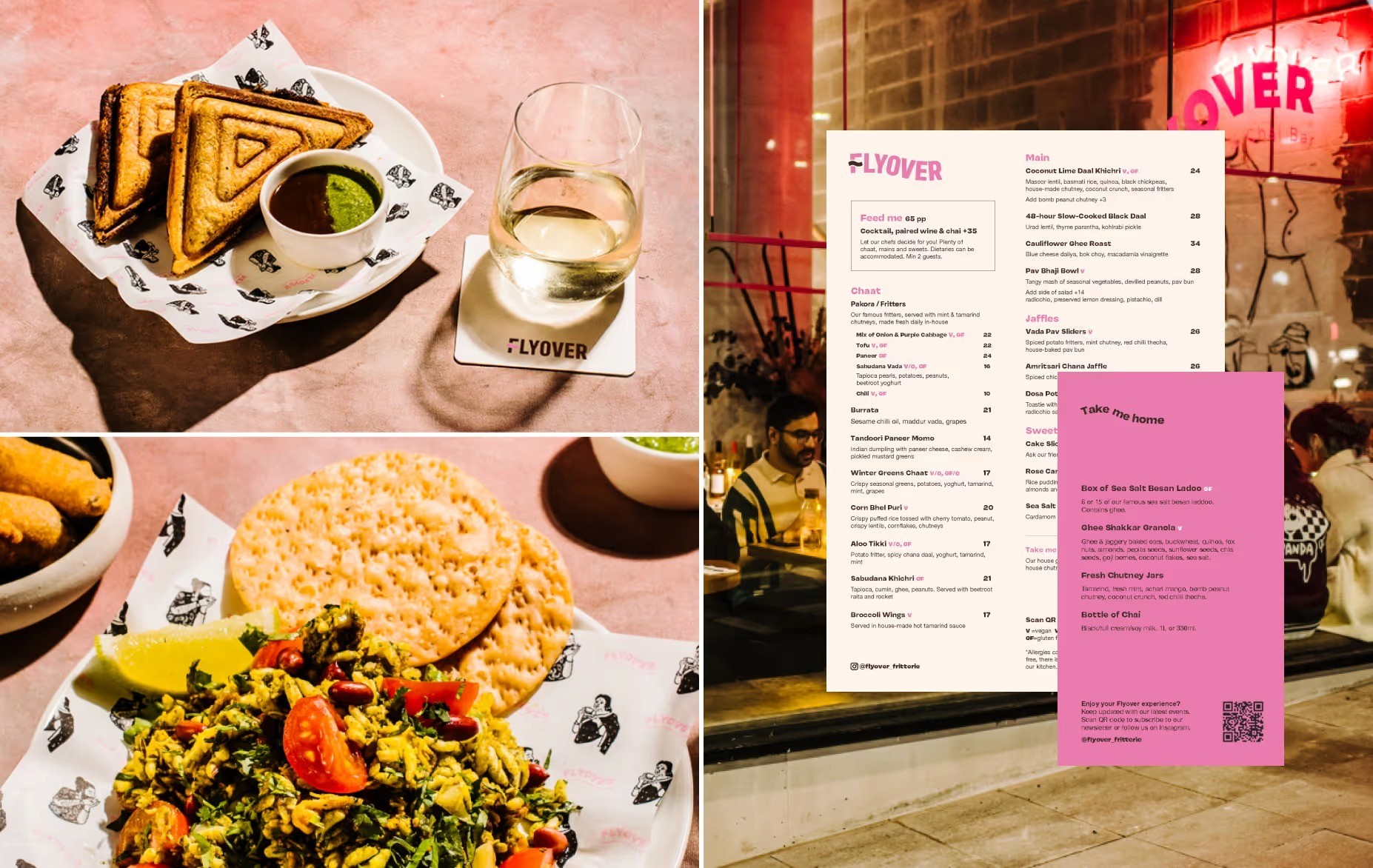
Collaborating with photographer Alana Dimou, we directed a photoshoot that captured Flyover’s flavour-packed dishes using clean compositions and vibrant, direct lighting. These photos became a key driver of engagement and online booking.
05 Menu and website copy in Gunjan’s voice
We worked with Gunjan’s original voice, refining her vivid language and placing it at key touchpoints. Descriptions like 48-hour cooked black daal with a luscious, silky texture and spiced cocktails infused with fresh ginger and chai brought the experience to life, offering customers a rich preview of what was to come.
We also redesigned the printed menus to make unfamiliar dishes feel approachable and easier for staff to talk through with customers.
06 The website as a booking engine
The website was redesigned with two goals: reflect Flyover’s new identity, offering and market positioning and make it clearer and easier for customers to book.
Simplified navigation and clear calls to action, including Book a Table and links to Uber Eats
A dedicated section showcasing the upstairs dining area, which research showed many customers didn’t know existed
Mobile-first layout balancing editorial richness with fast load times
An editable menu system letting staff make quick updates without developer input
The site was built in Webflow. Google Lighthouse scores 97/100 for desktop and 69/100 for mobile.
07 A digital extension of the restaurant itself
Rather than treating the website as a separate marketing asset, the goal was for it to feel like a natural extension of Flyover in person, welcoming, confident and distinctly itself. With the brand and booking experience aligned across in-store and digital touchpoints, Flyover was set up to support its next phase of growth rather than just its launch.
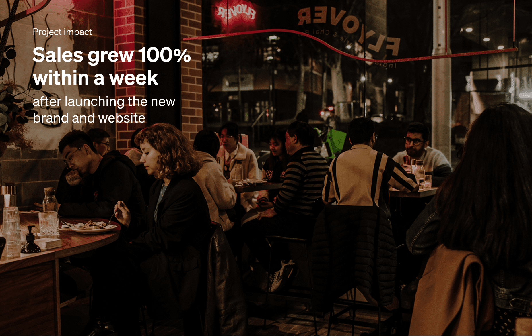
Project impact
Sales increased by 100% after the new brand and website launched
Weekend bookings doubled
Corporate catering enquiries grew
Flyover began showing up in unexpected places, including a collaboration with Kylie Kwong and a feature in a Powerhouse Museum exhibition
Billie Eilish chose Flyover while on tour in Sydney
ReCo continues to support Flyover as it builds on this foundation, helping the brand carry its identity into new spaces, partnerships and stages of growth.
Key takeaways for rebranding an already-known business
Discovery drives direction: spending real time inside the business surfaced insights no brief alone could have provided.
Customer research protects loyalty: understanding what already worked let the rebrand build on trust rather than risk it.
Position around what’s genuinely relevant: framing Flyover as vegetarian-first with deep Indian-rooted culture connected with a growing dining trend.
Refresh, don’t reinvent: keeping the elements customers already loved built confidence into the new identity rather than starting from zero.
The website should mirror the in-person experience: a site that feels like a natural extension of the physical brand does more to convert than one that simply describes it.
Rebrand and cultural marketing: FAQs
How do you rebrand a business without losing the customers who already love it?
Start with real conversations, not assumptions. Before any design work began, we spent time inside Flyover and spoke directly with the people who already loved it, from long-time regulars to first-time visitors. That research showed the brand’s story was already strong, it just wasn’t being told clearly. A refresh built on what customers actually say protects the loyalty a business has earned while still giving it room to grow.
How do you find the right positioning for a business with a strong cultural identity?
Look for where culture and relevance genuinely overlap. Flyover’s food is proudly Indian, and its vegetarian focus turned out to be the bridge to a much wider audience, especially as more Australians shift toward vegetarian and plant-forward eating. Positioning the brand as vegetarian-first with deep Indian roots let it stay authentic while speaking directly to where dining trends were already heading.
Should a rebrand change everything about a business?
Not if the core of it is already working. With Flyover, the brand personality, the founder’s voice and the illustrations customers already loved all stayed. We softened the colour palette, refined the logo and sharpened the messaging – small, deliberate changes rather than a full reinvention. Knowing what to keep is often just as important as knowing what to change.
How much difference does website design actually make for a business with a physical space?
More than most business owners expect. Flyover’s research showed customers didn’t even know its upstairs space existed, a gap that was costing real business before anyone even walked in. Fixing that, alongside clear calls to action and a mobile-first build, gave the site a direct hand in the sales growth that followed launch.
What makes a brand’s voice feel authentic instead of generic?
Start with the founder’s own words. Gunjan already had a distinctive, slightly playful way of describing her food, so the role of the rebrand was to refine that voice rather than write over it. Menu lines that sound like a real person talking about food they love do more for a brand than polished copy ever could.
Services
Research and strategy
Immersive discovery and on-site research · Customer interviews and persona development · Cultural brand positioning
Brand and identity
Visual identity refresh · Logo and colour palette refinement · Illustration and photography art direction
Content and copywriting
Founder-voice copywriting · Menu and website content · Editorial photography direction
Website design and development
Website design and Webflow development · Editable menu system
Credits
Collaborator: Flyover / Gunjan Aylawadi
Branding & website design: Danling Xiao
Photography: Flyover / Alana Dimou
Case study presentation visuals: Mayu Ashizawa


